
Rakuten Sports - Content integration on an OTT streaming platform
OVERVIEW
After years of investment into various sports teams, properties, athletes, and sponsorships, an inconsistent volume of consumable video media was scattered across various existing Rakuten streaming services such as Rakuten TV and Rakuten Viki. Around summer of 2018, Rakuten decided to increase their focus in sports, and as a result, Rakuten Sports was born around the summer of 2018. Since then, I moved into the Global Sports Business as the sole Product Designer to shape, build, and nurture the platform into a standalone, Over-The-Top (OTT) media streaming platform for Rakuten’s sports-related properties.
TIMELINE
August 2019 - Current (Ongoing)
ROLE
Product Designer
METHODS & TOOLS
Domain Research, Competitive Analysis, Content Audit, UX Copywriting, Affinity Mapping, Bubble Chart Weighing, Information Architecture, Card Sorting, Use Cases, Mural, Figma
TEAM
Ming Tak Chow (Product & Development Manager)
Hiroto Hori (Head of Strategic Projects)
Marc Blanco (Global Sports Business, Strategic Planning)
PROJECT BACKGROUND
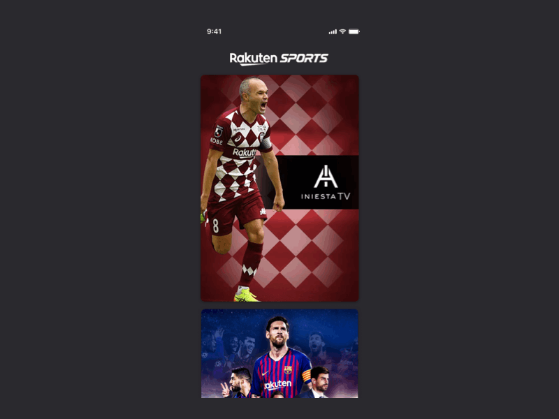
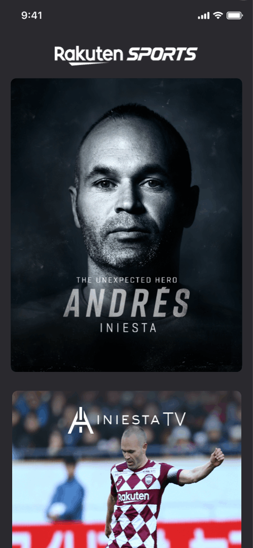
With any streaming service, content is a large investment. One of which was “Iniesta TV”, a documentary-series around footballer Andrés Iniesta, produced exclusively for Rakuten that follows the life of Iniesta, particularly during the period after his departure from FC Barcelona, and arrival to Japan’s Vissel Kobe club.
PROBLEM
Iniesta TV was meant to be made exclusively available on Rakuten Sports and heavily promoted, however, not enough attention or effort was made due to a lack in prioritization and resourcing. On top of this, users weren’t aware of the content, there was a lack of proper content management, and the Business unit had many more ideas on how to present this content that were not realized. As a result, the Business unit overseeing Iniesta TV wasn’t happy, which meant Andrés Iniesta himself wasn’t happy, which meant Mickey wasn’t happy either!
OPPORTUNITY
I joined the fold when the first semblance of a team for Rakuten Sports was being scrappily pulled together along with other human resources borrowed from various scattered departments within the Media & Sports Department. Global Sports Business was only starting to put together a proposal for roadmap of what the Rakuten Sports would offer. What felt like things were all over the place, gave me the opportunity to take initiative in building and instilling a product design process that would align the vision and expectations across Business, Development, and Product cross-functionally. Amongst several property integrations that I lead, Iniesta TV’s process was a shining example highlighting the impact of design and business working closely together along every step of the design process.

My design process, determined based on the needs of this project.
DISCOVER
Collecting the pieces of the puzzle
As the entire Sports business was still grappling to figure out what to do, I began by conducting a thorough content audit of all existing IP.
Briefly mentioned earlier, Iniesta TV was technically available for public consumption through Rakuten Viki, a streaming service focused on Asian television dramas. As you can suspect, this was far from the ideal platform to be hosting Sports-related content about a Spanish footballer. In addition to Viki, A very early version of “Rakuten TV Sports” in it’s MVP form had been put together only 2-3 months before by the Viki design team as a means of “handling” the Sports content that needed a place to belong (At the time, Rakuten had exclusive, limited streaming rights to a few J-League soccer matches, and this, along with Iniesta TV’s catalogue at the time, was available from this Viki spin-off platform).

“Rakuten TV Sports” - an early MVP which uses much of the design DNA of Rakuten Viki (the entire CMS tool was also cloned and used at the time)

The same Iniesta TV content, available on the Rakuten Viki platform.
I conducted exhaustive research on Andrés Iniesta himself as well, to fully immerse myself in his history to better understand the domain. This allowed me to better empathize with the subject, the contents that were being released, and the audience that the content was intended for.
To familiarize myself with athlete-centric online platforms, I also benchmarked the digital presence of other standout athletes across various sports, including the likes of Cristiano Ronaldo, Lionel Messi, Jeremy Lin and Stephen Curry. To familiarize myself with curated sports-content platforms, I studied and benchmarked Masterclass, and The Players Tribune for ideas as well.
After being introduced to the Business members from Iniesta TV’s team, it became apparent to me early on that they were not used to working with a designer, much less have a clear understanding in software product development. It was at this point, I knew I needed to put on a different hat and have them more involved in the design process in order to first help them solicit the requirements, and determine what was the “problem” that they were looking to solve.
UNDERSTAND
No brief? No problem.
To accomplish this, I followed the “Lightning Decision Jam” method in order to quickly and efficiently define and solve challenges. This exercise basically combines the Sail Boat Retrospective, Dot Voting, “How Might We” brainstorming, and Impact x Effort matrix plotting - methods which I had previously used in the past on an as-needed basis. I decided to use this method because it would force business to critically think about issues, and clearly vocalize and expose any opportunity areas. The insights gained from the session would directly support outlining more defined requirements.
So I invited Hiroto Hori (Head of Strategic Projects), Marc Blanco (Global Sports Business, Strategic Planning), and Ming Tak Chow (Product & Development Manager) to participate in this workshop activity, while I moderated the workshop. The advantage of running this workshop with business team members is that they often can surface perspectives that are non-tech/design/development related, which are equally important, as it gives me a better understanding of the actual problem they are need solved, as opposed to arbitrarily asking for “Iniesta TV content to be available on the app platforms”.
Start with Retrospect

Results of the Sailboat Retrospective Exercise. Sticky notes above water represents all the things that are working well with Iniesta TV. The stickies under water represent all the challenges, annoyances, mistakes or concerns.
We first determined all the things that worked well. This was a feel-good all around the room, as business was able to identify and celebrate the good. Themes surfaced including exclusivity of content, a strong global presence, consistent and diverse media production, and buy-in from Andrés Iniesta.
Listing out what worked well first, provides better and more appropriate context when identifying pain points next. A diverse range of topics were uncovered. Participants then place 3 sticky dots on challenges that they consider to be the most pertinent to solve. Ranked issues and my insights below:
3 votes: Editorial, SNS, sports not connected
During my domain research, I managed to discover a editorial publication online that made references to Iniesta TV, seemingly published by Iniesta’s team, making references to a lot of content that overlapped with Iniesta TV. Business was not aware that this editorial platform even existed. Iniesta had active Twitter and Instagram channels, as did Rakuten (at the time, Rakuten’s “sports” media was represented under an Instagram official account called “Rakuten Arenas”). Rakuten Sports was standalone, simply. hosting the video content for viewing. Evidently, there was a gap here between different organizations, and an opportunity to capitalize with marketing and branding. This issue was the most voted on, and while it isn’t entirely an issue that can be solved through my contributions through UX/UI Design, it opened the doors for a separate conversation on overall content strategy, to better tie together Marketing efforts.
2 votes: Monetization, Unclear focus on what is the main goal of Iniesta TV
Monetization has been a struggle with the overall Sports business for quite some time now, and this exercise continues to emphasize this point. On the platform level, we were already building a product roadmap that would eventually shift us from an AVOD business model to a SVOD and TVOD model. The angle in which we needed to consider now was, out of the current and future planned contents for Iniesta TV, what opportunities were there for monetization via the Rakuten Sports platform?
Arguably the point that perked my ears the most was the lack of a clear goal of the Iniesta TV platform. I also found this point very valid during my content audit and domain research. Iniesta TV’s catalog of over 60+ short videos, sorted into 5-6 categories, existed with little to no context for viewers.
1 vote: lack of cool design, lack of diverse content on Rakuten Sports, development on Desktop Web despite high mobile traffic, lack of editorial content, lack of intuitiveness
Many of these were issues I had already begun solving for, including lack of cool design (that’s why I’m here now, right!?), improving usability, and taking a mobile first approach to the design and development of the platform.
How Might We: Convert problems into challenges and come up with solutions
Next, I had everyone take the top pain points from the retrospect activity, and reframe them as standardized challenges using the “how might we” format. Starting with the most voted:
Pain point/Problem
Editorial, SNS, Sports, not connected
Challenge Statement: How might we…
Allow users to see all channels of Iniesta content?

Results of the HMW exercise after voting on solutions.
Next, we took 5 minutes to time box solution ideation without discussion. Everyone silently sat around the room, writing their solution ideas on stickies, with the context of the Challenge statement in mind: “How might we allow users to see all channels of Iniesta content?”. The idea here is to go for quantity as opposed to quality. After collecting everyone’s ideas and posting it onto a whiteboard, we took another round of dot-voting. Looking at the results, it was clear that the onus was on the business team to bridge the gap between these different vendors representing Iniesta, and introducing cross-collaboration between these various platforms to exchange visibility, along with a bit more resource in social media activity. From the design side, there was an opportunity to visit the Information Architecture of all the content to help users better breakdown and understand the content in a relevant and interconnected way.
In the same session, we addressed one more highly voted on solution:
Pain point/Problem
Unclear focus on what is the main goal of Iniesta TV
Challenge Statement: How might we…
allow users to get value out of Iniesta TV

This round yielded a variety of ideas! The dot results showed an interesting spread of what everyone considered as priority. Similar to the previous round, this activity was equally as eye-opening for business, as they were mostly in agreement on the different things that need to be set in motion, concurrent with the platform that I was responsible for designing - after all, many of these ideas would indirectly impact the platform’s success and performance. I felt that there was enough ideas presented during this round, so we took the solution cards from here and began plotting each solution card against an Impact x Effort matrix.
Prioritizing solutions

Address the low hanging fruit.
This table, as labelled, is pretty straightforward. The upper left Quick Win quadrant are high impact, low effort solutions that can be done easily and quickly. In this quadrant, we observed that two solutions with votes made it to the top. Business committed to sticking with a timely release schedule in order to retain engagement with viewers, and would present a case to work with Andrés Iniesta’s management to coordinate SNS efforts timed with the release of new video content.
Using story-telling as a means to increase empathy and user engagement.
On the border of Quick Win and Major Project, had a lot of solution ideas clustered. This cluster essentially pointed to a smarter, more focused content strategy. Based on my research of the existing media content, I suggested that the app and web platforms could be used as an extension of the video format to complement the narration and story-telling of the Iniesta TV series, providing additional context around the videos that would be available for consumption, which would hopefully create higher levels of engagement with users.
Shaping the roadmap in the process
Several highly voted points landed in the High Impact, High Effort category - mostly due to input from Ming, as the existing content management system was not yet at a maturity level to support advanced features such as an eCommerce portal, or live-posting/live-streaming from Iniesta. That being said, the product roadmap was then readjusted, with several of these ideas included in for future development. As of writing, Rakuten ID integration made it into the roadmap and development for this feature was recently developed as well!
This activity is intended to facilitate ‘blue sky thinking’; the idea is to encourage everyone to think beyond the scope of this project. This is important in order to not shoehorn the mind into only thinking about the issue from the context of an app or a website.
IDEATE
Content is everything
Analyzing the outcome of the Lightning Decision Jam workshop, I determined that incorporating a narrative, story-telling component into the web/app service would need some work. Before jumping into the analysis of the workshop, let’s take a look at the current state of content organization.
At the time, the catalog of videos were divided into 9 categories:
Vissel Kobe
Discover Japan
Interviews
Football Skills
Business
Iniesta’s Methodology
Fuentealbilla
Iniesta’s Team
Documentary Behind the Scenes
Out of the 9 categories, Business only had content populated in 5 of these categories (bolded), with more content planned for remaining sections in the future. I observed two things.
While the division of categories was very specific, my hypothesis was that the information architecture was slightly disconnected in context from one another, so in order to help users feel more connected with the content, a more simplified, general layer between the sections might be helpful.
Within each category, there was a considerable number of videos that were related in a sequence. I.e., Vissel Kobe had an entire series covering the USA-tour, broken into 12 short videos, but these videos were thrown into the Vissel Kobe category along with dozens of other videos.
I set up another collaborative white boarding session with the same members to perform a real-time card sorting exercise. On a whiteboard, each stakeholder would brainstorm and write down how they would organize their content based on their experience and knowledge, then explain their reasoning behind the structure, and to group the contents by a broader topic. Before analyzing the results of that session, let’s take a look at the current content structure. Here were their results:

Marc’s Sort.

My Sort.

Hori’s Sort
Creating user-relatable channel groupings
Analyzing the results of the card sort, I was able to infer that there were 5 distinct categories, that would provide a solution to the first hypothesis:
Football (covers Vissel Kobe)
Off the Pitch (covers Discover Japan, Fuentealbilla)
Education (covers Iniesta Methodology, Football Skills)
Business (covers Brands)
Interviews (covers Interviews, Iniesta’s Team)
This new structure would provide additional context and better understandability with users (especially first time users), to better relate to the content and Iniesta, before exploring individual sections.

The new IA I proposed would introduce a “Series Grouping” to better contextualize the contents, providing a better narration
Improving content organization within each channel
Next, I listed out all videos on a spreadsheet, and together with business, we went through each line and determined which videos belonged in a multi-part series, and which series would be standalone videos. This was the solution to resolve the second hypothesis.

The revised Information Architecture that we would be moving forward with
Proposing the revised IA structure
I presented the revised IA to both business and development team stakeholders. There were some limitations from the development side, mostly involving the lack of a compatible content management system (at current, a forked version of the CMS driving Viki content was still being used, posing challenges for IA development). With the proposed IA changes I was suggesting to implement to better fit Iniesta TV’s content, here’s how it would look next to other content properties, within the overall platform-level information architecture.

The structure would introduce a new level within the current hierarchy structure; a “channel detail page”
Compatibility with existing back-end information architecture
Contents up to this point consisted of a “landing page” for each title, an optional “series detail page” (much similar to a TV show listing X number of episodes for a given TV show), and the individual videos themselves. Incorporating the new layer for Iniesta TV would introduce a second optional layer in between the landing page and the series detail page. This Channel detail level would support listing out numerous series within a section; very much like how you might change channels on a TV cable box, and have access to a variety of TV series on that channel. I was able to negotiate an interim solution with business and development, which allowed work to begin on the back-end API architectural changes.
Parking Lot
For this project, I had planned to put the new structure in front of users, but as far as all real-world projects go, there was a release timeline that the Business unit was targeting, which unfortunately cut the time resources needed to conduct any formal user research. The plan to launch the renewed platform ahead of the restart of the 2020 season was non-negotiable, so we agreed to revisit user-validation and testing post-release, gearing up to the next revision.
EXECUTE
Wireframes
With business and development onboard with the new IA, I began building blockframes illustrating the new ‘channel level’ and ‘series level’ screens for mobile first (because, as we identified earlier during the Retrospect, there was a lack of focus on mobile, despite 80%+ of the existing traffic coming in through mobile).

Top level blockframe design iterations.
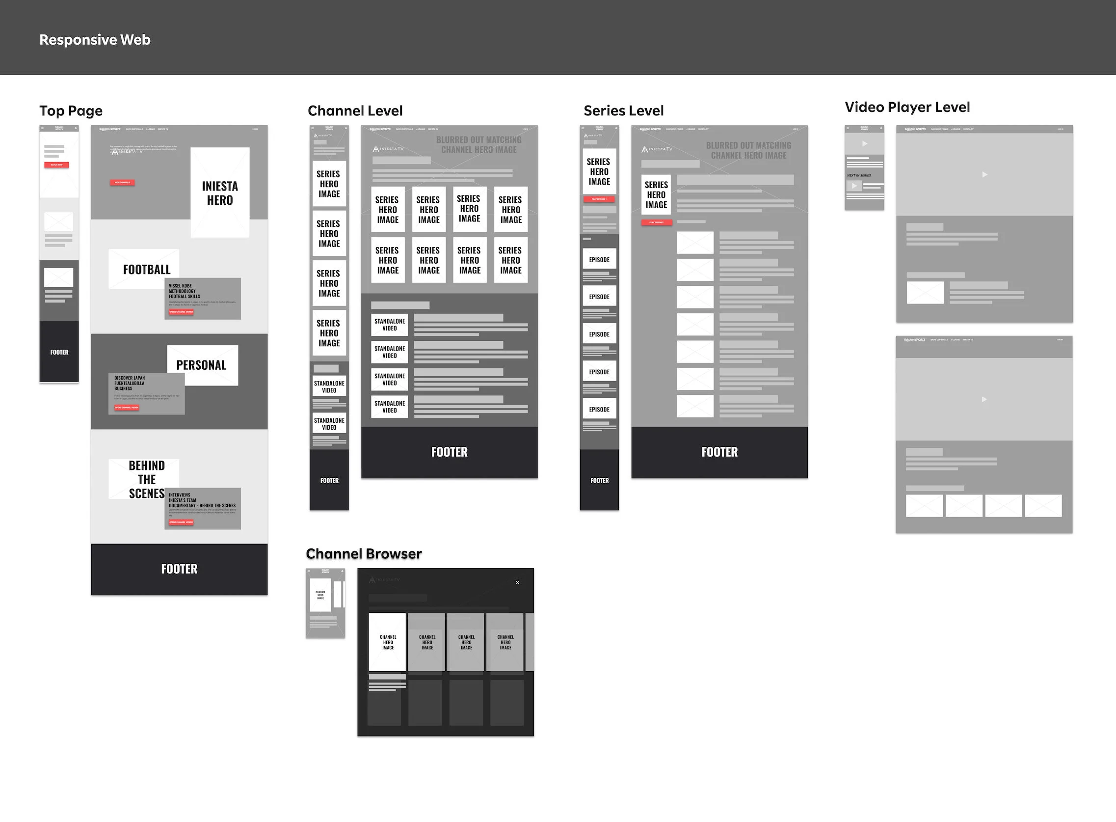
I created numerous designs at low-fidelity for the Business team to review. I ran through my intentions with each design. Part of that intention for a narrated experience called for some UX copywriting work to be put in as captions for each channel and each series. With no dedicated content strategist or UX copywriter, I partnered with Marc to create the copy, providing advice and guidelines for effective copywriting and the impact on UX, while he provided the narration (literally) and subject expertise.
Thanks in part to the collaborative workshops conducted earlier, there were no surprises, and no need for any big redesigns or reiterations - a huge time saver, particularly in the case with this project on a tight deadline.
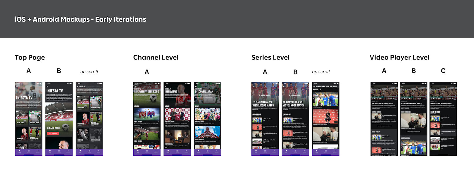
Early concept mockup iterations of iOS, Android key screens.

Early concept mockup iterations of Responsive Web key screens.
Putting the “TV” experience into Iniesta TV
There were 6 properties that we had streaming rights to at the time of writing (October 2020). Each media section had a varying compositions in video categorizations. Iniesta TV stood out amongst the rest of the media properties. I considered the number of levels in the hierarchy to be uncommon ( Top > Channel Level > Series Level > Video ID ), compared to most other TV shows that might offer multiple seasons for a specific TV series. As such, I felt that the browsing experience would be best understood by users if the interaction felt like they were flipping through channels on a cable box TV. Here was an A/B design exploration of a horizontal vs vertical style, channel browsing experience.
A: Horizontal style, card style carousel scrolling intended to resemble browsing through movie posters

B: Vertical style, full spread hero image backdrop to represent channel content, intended to resemble how one may typically navigate their TV top box
Embracing the niche
The Big Picture
When you think of streaming services, YouTube, Netflix or other similar household names usually pop up. Though Rakuten Sports is indeed an OTT Platform, our content was not only much more niche, but also very limited. The design was highly influenced on the nature of the information and content that was available. While I did mention that there were 6 properties as of writing, during Iniesta TV’s early launch there were actually only 3 sections of content… on a good day. Other contents were only available for certain GEOs. This meant that for the majority of the world, you would see only Iniesta TV when you reach Rakuten Sports. How does one design a multi-sports streaming platform when you only have 1 property, and 1 sport? As much as I wanted to think about scalability for this implementation, the content constraints were truly the most challenging aspect.
The root view of Rakuten Sports needed to promote newly introduced contents, while remaining neutral and not favoring a certain content before another. Arguably, I also needed to come up with a way to make the platform seem less empty… so in consideration of designing for the now and anticipating the contents that we were expected to receive over the next 6 months, the first iteration used a single column feed-style layout, with each section represented using cards. I split the design into two columns subsequently, in order to allow users to at-a-glance better see the portfolio of contents available to them, but also to better support scalability for when we were expected to introduce more contents.
Root View - first iteration. Feed style, card-based browsing experience
Root View - second iteration. 2 column to support better scalability based on expected future contents
These two versions would work, but for users unfamiliar with these sports titles, the movie poster key visual simply wasn’t providing enough context. So in order to balance a showcase of our limited/curated content, I suggested a two-view method of supporting user exploration of content, retaining the ‘movie poster’ motif in one view, while still providing users the option to jump right into the latest (albeit, infrequently uploaded) content with a “Latest Content” video feed.
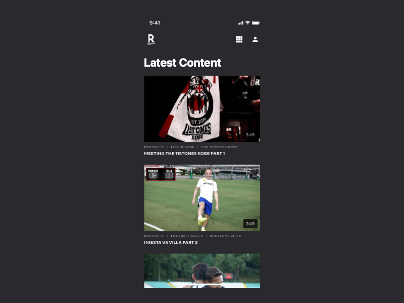
Latest design iteration of root view, showcasing two views - latest content feed view and a curated, portfolio, movie-poster style coverflow carousel.
For the responsive web experience, I created a design that would reflect a curated portfolio of exclusive media properties, to work within the constraints of content variety. This is evident in the choice of colors. I settled on an “always dark mode” in order to engage users in a theatrical, cinematic way. I opted for large, feature spreads to highlight contents, similar to how a photographer might highlight their curated works. This is in contrast to simply displaying a vast library of endless hours of content, in YouTube or Netflix fashion.
Iniesta TV’s content was launched officially in February 2020, and since then, there have been continual improvements, all the while the Rakuten Sports platform itself continued to grow. The platform’s IA remained largely unchanged, while I had the opportunity to touch up the UI over the next 6 months. Here are the latest designs as of October 2020.
Designs as of October 2020.
RETROSPECT
Impact
Aligned expectations and directions through a collaboration oriented workshop instead of meeting based sessions
Surfaced the significance of having a defined content strategy, resulting in the formation of a dedicated Business arm dedicated to content strategy
Eliminated risk by having Business, Product and Tech teams participate in the definition phase of the project. This cut off future miscommunications and misalignments
Reduced design time and iteration cycles
Content strategy, information architecture, and consistency between platforms greatly helps with creation and maintenance of APIs and component reuse for Tech teams
Sequential video viewership increased more than 10x, user browsing activity increased more than 3x
Key Takeaways
The entire Rakuten Sports platform is very much a running product experiment, as the company continues to incubate a business proposition for the Global Sports Business. Throughout this project, the case study presented here was shared by the Product Manager to showcase the success behind the collaborative working method, and instantly gained strong traction with several other groups within Rakuten, with many inquiring on adopting a similar collaboration style.
While facing these challenges to design for a very business-driven initiative, I reflect on the questions that continue to challenge me to this day:
How do you incorporate the user’s voice when the product need is driven purely from business?
When it’s unclear what user problems are being solved, but there’s a top-down initiative to create a product and platform, how do you design for it?
Content is king. When geography limitations add on top of already very limited content, how do you design something when the content is very limited?
As the saying goes, “it's not about the destination it's about the journey”. Design is not purely about the final result, but the progress itself is equally as important.
Iniesta TV and Rakuten Sports are currently still undergoing design and development. This case study does not represent the final product, but showcases examples from several iteration cycles throughout the design process.